

Photo Gallery 1.0

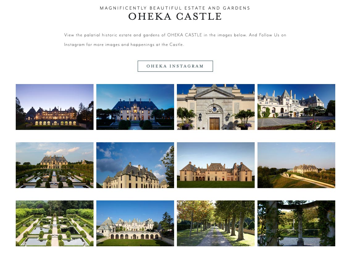
Photo Grid 1.0
Photo Grid
The "ADA - Photo Grid 1.0" widget provides more options to display a photo gallery, allowing you to choose between 1-4 photos per row on desktop.
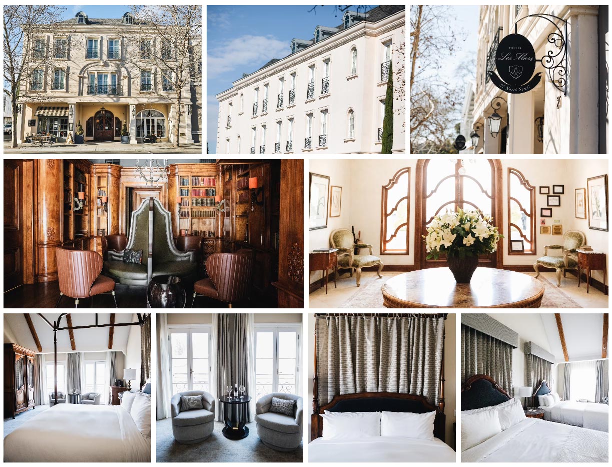
Photo Grid with Content Box 1.0
Photo Grid with Content Box
Lorem Ipsum
Lorem ipsum dolor sit amet, consectetur adipiscing elit, sed do eiusmod tempor incididunt ut labore et dolore magna aliqua.
Photo Mosaic 1.0